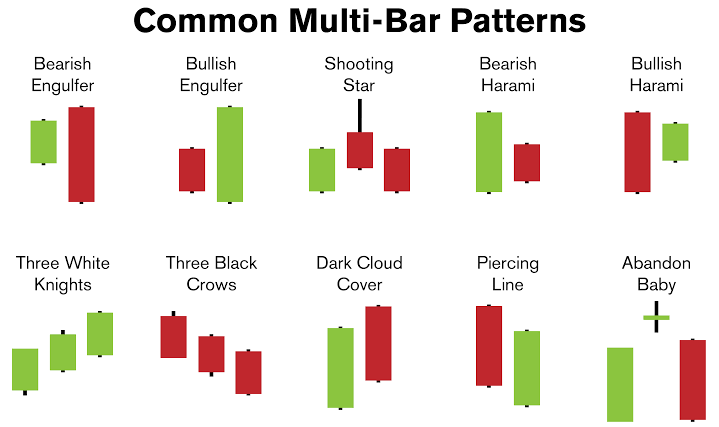
The first time I looked at a candlestick chart, it genuinely looked like a bunch of red and green rectangles thrown together randomly. Took me a solid week of staring at charts before it clicked. If you’re at that stage right now, don’t worry — understanding candlestick chart patterns isn’t as complicated as it initially looks.
What Is a Single Candlestick Actually Showing You?
Each candlestick represents price movement over a specific time period — could be a day, an hour, even a minute, depending on your chart settings.
A single candlestick shows four key prices for a given time period: the opening price, closing price, highest price, and lowest price — with the “body” showing open-to-close range and the “wicks” showing the extreme high and low.
- Green (or white) candle: closing price was higher than opening — bullish
- Red (or black) candle: closing price was lower than opening — bearish
- The thin lines above/below the body are called “wicks” or “shadows”
Why Candlestick Charts Beat Simple Line Charts
A line chart only shows you the closing price, connected day to day. It hides a lot of useful information. Candlestick charts show the full story of a day’s trading battle — where price opened, how high buyers pushed it, how low sellers dragged it, and where it settled.
Has this ever happened to you — you check a line chart and think a stock had a “quiet day,” only to later realize on the candlestick chart it actually swung wildly before settling flat? That’s exactly the information a line chart hides.
Common Candlestick Patterns Worth Knowing
You don’t need to memorize all 40+ recognized patterns. Start with these:
- Doji — open and close are nearly equal, signals indecision in the market
- Hammer — small body, long lower wick, often signals a potential reversal after a downtrend
- Engulfing pattern — a candle’s body completely “engulfs” the previous candle’s body, often signaling a trend shift
- Shooting star — small body, long upper wick, appearing after an uptrend, often signals a potential reversal downward
A Practical Example
Picture a stock that’s been falling for five straight sessions. On day six, you spot a hammer candlestick — small body near the top, long wick stretching down. This suggests sellers pushed price down hard during the day, but buyers stepped in and pushed it back up before close. That’s often read as an early signal that selling pressure might be exhausting, though it’s never a guarantee on its own.
[link to related guide about best time to trade stocks here]
How to Actually Use These Patterns While Trading
I’ll be direct here — no single candlestick pattern should be your only reason to buy or sell. Combine pattern recognition with:
- Overall trend direction (are we in an uptrend or downtrend broadly?)
- Volume data (a pattern backed by high volume carries more weight)
- Support and resistance levels on the chart
Relying purely on one candlestick without this context is how a lot of beginners lose money fast.
Mistakes Beginners Make Reading Candlestick Charts
The most common one I’ve seen: treating every single candle as a “signal” worth acting on. Most candles are just noise. Patterns matter more when they form at meaningful points — near support/resistance levels, or after an extended trend.
Suggested alt text: “Candlestick chart diagram showing hammer, doji, and engulfing patterns”
FAQ
Are candlestick charts better than line charts for beginners? Yes, generally — they show more information (open, high, low, close) in a single glance, which helps build better intuition over time.
What time frame should beginners start with when reading candlestick charts? Daily charts are usually the easiest starting point before moving to shorter intraday time frames.
Can candlestick patterns predict stock prices accurately? Not with certainty — they indicate probability and market sentiment, not guaranteed outcomes, and should be combined with other analysis.
How long does it take to get comfortable reading candlestick charts? Most people start recognizing basic patterns within a few weeks of regular practice on real or simulated charts.
Do candlestick patterns work the same way in all markets? The core logic applies across stocks, forex, and crypto, though reliability can vary based on market volatility and liquidity.
Conclusion
Reading candlestick chart patterns is one of those skills that feels overwhelming initially and then suddenly makes sense — usually all at once, not gradually. Spend time pulling up real charts, identifying patterns you’ve learned, and checking what happened after. That practice, more than any single article, is what actually builds the skill.